
Public Data Visualization Studies
Visualization 1: NY State Petroleum Spill Incidents Timeline
Question: Are the yearly variations in New York’s petroleum spill incidents a data quality issue or a real trend?
Figure 1: New York State petroleum spill incidents (1978–2024), showing unique spills per year with key policy and technology events annotated. Three eras are shaded: (1) Pre-Reporting (gray, 1978–1986), when spill reporting was not mandatory and counts were low; (2) Mandatory Reporting (orange, 1986–1999), when the Environmental Conservation Law required spill disclosure, driving a sharp spike and sustained growth that peaked in 1994; and (3) Prevention Era (green, 1999–2024), when EPA Underground Storage Tank upgrades and modern leak-detection technology reduced spills. Hurricane Sandy (October 2012) caused a spike as storm surge flooded 76% of NY Harbor petroleum terminals and displaced residential heating oil tanks. The 2020 dip coincides with COVID-related reductions in industrial activity. Data source: NY DEC Spill Incidents Database.
Note: Filtered to petroleum spills only (Material Family = “Petroleum”), excluding hazardous materials, sewage, and other non-petroleum incidents. Outliers removed using a log-scale IQR method. Colorblind-safe palette (Wong, Nature Methods 2011).
Visualization 2: California Disease Trends — Cases and Sex Ratio
Question: Do Coccidioidomycosis and Legionellosis show different temporal trends in total incidence and sex-specific risk in California?

Figure 2: This compares trends in Coccidioidomycosis (Valley Fever) and Legionellosis cases in California from 2001 to 2023. The two diseases follow different patterns. Panel A shows total reported cases by year: Coccidioidomycosis cases spiked after 2010, mainly due to environmental changes in the San Joaquin Valley. In contrast, Legionellosis cases stayed relatively low and grew only slightly. Panel B shows the male-to-female case ratio over time, where a ratio of 2.0 means twice as many male cases as female cases. Both diseases stay above the 1.0 baseline throughout the period, meaning men are consistently more affected. Coccidioidomycosis had the more volatile ratio early on, peaking at 2.66 in 2006, but has been trending downward since around 2010 and dropped to 1.27 by 2022. Legionellosis fluctuates year to year without a clear trend, ranging from 1.25 to 2.44. Overall, the two diseases have similar long-term averages (about 1.75), but Coccidioidomycosis shows a notable narrowing of the sex gap in recent years. Data source: California Department of Public Health.
Note: Colorblind-safe palette (Wong, Nature Methods 2011) with distinct markers and line styles for black-and-white printing.
Visualization 3: Spill Size Shift After EPA Tank Upgrade Deadline
Question: Did the EPA’s 1998 Underground Storage Tank upgrade deadline shift the distribution of petroleum spill sizes in New York?

Figure 3: Comparison of petroleum spill size distribution before and after the EPA’s 1998 Underground Storage Tank upgrade deadline. Small spills under 10 gallons became more prevalent post-1999, while large and major spills decreased in proportion. This shift is most likely related to the transition from corrosion-prone single-walled steel tanks to modern double-walled systems with leak detection. The grouped bar chart enables direct percentage comparison across three size categories. Data source: NY DEC Spill Incidents Database.
Note: Filtered to petroleum spills only. Outliers removed using the same log-scale IQR method as Figure 1.
Visualization 4: America’s Most Dangerous Industries
Question: Which industries have the highest workplace fatality counts, and what is the primary hazard that kills workers in each one?

Figure 4: The 10 U.S. industries with the most workplace fatalities from 2015 to 2023, according to the BLS Census of Fatal Occupational Injuries. Each dot represents the total number of deaths in an industry, and its color shows the main cause of death. Specialty Trade Contractors and Truck Transportation each had over 4,900 deaths during this period, which is more than double the number of the third-highest industry. The main hazard varies by industry; for example, transportation incidents are the leading cause in trucking, crop production, and administrative services; falls are the top cause in construction trades; and violence, such as robberies and assaults, is the main cause in food services. Data source: U.S. Bureau of Labor Statistics.
Note: Data deduplicated at the 3-digit NAICS sector level to avoid double-counting across industry hierarchy levels. Colorblind-safe palette (Wong, Nature Methods 2011).
Visualization 5: Sex Disparity in CA’s Top Communicable Diseases
Question: Do California’s most reported communicable diseases affect men and women equally, and is the disparity changing over time?

Table 1: This figure shows sex differences among California’s 10 most reported communicable diseases from 2001 to 2023. Most diseases are more common in men. Legionellosis and Vibrio Infection have the highest male-to-female ratios (about 1.72), and Giardiasis and Coccidioidomycosis also have ratios above 1.6. However, Salmonellosis and Shiga toxin-producing E. coli (STEC) are more common in women (M:F ratio below 1.0). The Trend column shows how the male percentage changed from 2001–2008 to 2016–2023, where positive values mean the male share increased and negative values mean it decreased. Data source: California Department of Public Health.
Note: Top 10 diseases ranked by total statewide cases.
Code Appendix
Code
# ============================================================
# Visualization 1: NY Petroleum Spill Timeline (Area Chart)
# ============================================================
import warnings
warnings.filterwarnings('ignore')
import pandas as pd
import numpy as np
import matplotlib.pyplot as plt
import matplotlib.patches as mpatches
import seaborn as sns
# Wong colorblind-safe palette (Nature Methods 2011)
WONG = sns.color_palette('colorblind')
BLUE = WONG[0] # #0072B2 — main data color
ORANGE = WONG[1] # #D55E00 — mandatory reporting era
GREEN = WONG[2] # #009E73 — prevention/technology era
ERA_GRAY = '#999999' # pre-reporting era
ANN_GRAY = '0.45' # annotation text/arrows
# Load and prepare data
df = pd.read_csv('data/Spill_Incidents.csv')
df = df[df['Material Family'] == 'Petroleum'] # petroleum spills only
df['Spill Date'] = pd.to_datetime(df['Spill Date'], errors='coerce')
df['Year'] = df['Spill Date'].dt.year
df = df[(df['Year'] >= 1978) & (df['Year'] <= 2024)]
# --- Outlier removal using log-scale IQR ---
# Standard IQR fails on heavily skewed data (fence at 72 gal).
# Log-transforming non-zero quantities first gives a robust fence.
nonzero = df.loc[df['Quantity'] > 0, 'Quantity']
log_q = np.log10(nonzero)
Q1, Q3 = log_q.quantile(0.25), log_q.quantile(0.75)
upper_fence = 10 ** (Q3 + 1.5 * (Q3 - Q1))
n_before = df['Spill Number'].nunique()
# ~ (NOT) instead of <= so rows with NaN quantity are kept, not dropped
df = df[~(df['Quantity'] > upper_fence)]
n_after = df['Spill Number'].nunique()
# Count unique spills per year after cleaning
yearly_unique = (df
.drop_duplicates(subset=['Spill Number'])
.groupby('Year')
.size())
# Create visualization
fig, ax = plt.subplots(figsize=(7, 4))
fig.patch.set_facecolor('white')
ax.set_facecolor('white')
# 3 era bands — high-contrast colors (gray / orange / green)
ax.axvspan(1978, 1986, alpha=0.15, color=ERA_GRAY, label='_')
ax.axvspan(1986, 1999, alpha=0.15, color=ORANGE, label='_')
ax.axvspan(1999, 2024, alpha=0.15, color=GREEN, label='_')
# --- Accessibility: vertical boundary lines at era transitions ---
ax.axvline(1986, color=ANN_GRAY, linewidth=1, linestyle='-', alpha=0.5)
ax.axvline(1999, color=ANN_GRAY, linewidth=1, linestyle='-', alpha=0.5)
# Area chart — primary blue from Wong palette
ax.fill_between(yearly_unique.index, yearly_unique.values,
alpha=0.25, color=BLUE)
ax.plot(yearly_unique.index, yearly_unique.values,
color=BLUE, linewidth=2)
# Annotations — minimal labels, let the trend speak for itself
ann = dict(fontsize=7.5, bbox=dict(boxstyle='round,pad=0.2',
facecolor='white', edgecolor=ANN_GRAY, alpha=0.9))
ax.annotate('1986: ECL Reporting Law', xy=(1986, yearly_unique[1986]),
xytext=(1977, 11000),
arrowprops=dict(arrowstyle='->', color=ANN_GRAY, lw=1), **ann)
ax.annotate('1999: EPA Tank Upgrades', xy=(1999, yearly_unique[1999]),
xytext=(2001, 17500),
arrowprops=dict(arrowstyle='->', color=ANN_GRAY, lw=1), **ann)
ax.annotate('2012: Hurricane Sandy', xy=(2012, yearly_unique[2012]),
xytext=(2006, 5500),
arrowprops=dict(arrowstyle='->', color=ANN_GRAY, lw=1), **ann)
ax.annotate('2020: COVID', xy=(2020, yearly_unique[2020]),
xytext=(2015, 14500),
arrowprops=dict(arrowstyle='->', color=ANN_GRAY, lw=1), **ann)
# Labels and formatting
ax.set_xlabel('Year', fontsize=11, fontweight='bold')
ax.set_ylabel('Unique Petroleum Spills per Year', fontsize=11, fontweight='bold')
ax.set_title('NY State Petroleum Spill Incidents (1978-2024)',
fontsize=12, fontweight='bold', pad=25)
ax.set_xlim(1976, 2025.5)
ax.set_ylim(0, 19000)
ax.grid(True, alpha=0.3, linestyle='--')
ax.set_axisbelow(True)
ax.tick_params(labelsize=9)
# Legend — horizontal row below the title, outside the data area
legend_elements = [
mpatches.Patch(facecolor=ERA_GRAY, alpha=0.3, label='Pre-Reporting (1978-86)'),
mpatches.Patch(facecolor=ORANGE, alpha=0.3, label='Mandatory Reporting (1986-99)'),
mpatches.Patch(facecolor=GREEN, alpha=0.3, label='Prevention Era (1999-24)')]
ax.legend(handles=legend_elements, loc='lower center',
bbox_to_anchor=(0.5, 1.02), ncol=3, fontsize=7,
framealpha=0.9, edgecolor=ANN_GRAY)
plt.tight_layout()
fig.add_artist(plt.Line2D([0, 1], [0, 0], transform=fig.transFigure,
color='0.5', linewidth=0.8))
plt.show()Code
# ============================================================
# Visualization 2: CA Disease Faceted Panel (Line Charts)
# ============================================================
import warnings
warnings.filterwarnings('ignore')
import matplotlib.pyplot as plt
import numpy as np
import pandas as pd
import seaborn as sns
# Colorblind-safe palette (Wong, Nature Methods 2011)
sns.set_theme(style='whitegrid')
WONG = sns.color_palette('colorblind')
PRIMARY = WONG[0] # Blue
ORANGE = WONG[1] # Orange
ANN_GRAY = '0.45'
DISEASES = ['Coccidioidomycosis', 'Legionellosis']
COLORS = {'Coccidioidomycosis': PRIMARY, 'Legionellosis': ORANGE}
STYLES = {'Coccidioidomycosis': '-', 'Legionellosis': '--'}
MARKERS = {'Coccidioidomycosis': 'o', 'Legionellosis': 'x'}
# Load data
df_ca = pd.read_csv('data/CADiseases.csv')
# Filter to selected diseases, statewide, totals only
df_totals = df_ca[
(df_ca['Disease'].isin(DISEASES)) &
(df_ca['County'] == 'California') &
(df_ca['Sex'] == 'Total')
].copy()
# Filter for sex comparison (exclude Total)
df_sex = df_ca[
(df_ca['Disease'].isin(DISEASES)) &
(df_ca['County'] == 'California') &
(df_ca['Sex'] != 'Total')
].copy()
# Calculate Male-to-Female ratio by year for each disease
df_ratio = df_sex.pivot_table(
index=['Disease', 'Year'],
columns='Sex',
values='Cases',
aggfunc='sum'
).reset_index()
df_ratio['MF_Ratio'] = (
df_ratio['Male'] / df_ratio['Female'].replace(0, np.nan)
)
# Two stacked panels
fig, (ax1, ax2) = plt.subplots(2, 1, figsize=(7, 4.5), sharex=True)
# Panel A: Cases over time
for disease in DISEASES:
data = df_totals[df_totals['Disease'] == disease]
ax1.plot(data['Year'], data['Cases'],
marker=MARKERS[disease], linestyle=STYLES[disease],
markersize=4, linewidth=1.5, label=disease,
color=COLORS[disease])
ax1.set_ylabel('Total Cases', fontsize=9)
ax1.set_title('A - Total Cases by Year', fontsize=10, fontweight='bold', pad=25)
ax1.legend(fontsize=8, loc='lower center',
bbox_to_anchor=(0.5, 1.02), ncol=2,
framealpha=0.9, edgecolor=ANN_GRAY)
ax1.tick_params(labelsize=8)
ax1.yaxis.set_major_formatter(
plt.FuncFormatter(lambda x, p: f'{int(x):,}'))
# Panel B: Male-to-Female ratio over time
for disease in DISEASES:
data = df_ratio[df_ratio['Disease'] == disease]
ax2.plot(data['Year'], data['MF_Ratio'],
marker=MARKERS[disease], linestyle=STYLES[disease],
markersize=4, linewidth=1.5, label=disease,
color=COLORS[disease])
ax2.set_xlabel('Year', fontsize=9)
ax2.set_ylabel('Male-to-Female Ratio', fontsize=9)
ax2.set_title('B - Sex Ratio by Year', fontsize=10, fontweight='bold')
ax2.tick_params(labelsize=8)
# Pad x-axis so first/last points don't sit on the border
ax2.set_xlim(2000, 2024)
plt.tight_layout()
fig.add_artist(plt.Line2D([0, 1], [0, 0], transform=fig.transFigure,
color='0.5', linewidth=0.8))
plt.show()Code
# ============================================================
# Visualization 3: Spill Size Pre/Post Comparison (Bar Chart)
# ============================================================
import warnings
warnings.filterwarnings('ignore')
import matplotlib.pyplot as plt
import numpy as np
import pandas as pd
TAB10 = plt.cm.tab10.colors
PRIMARY = TAB10[0] # Blue
ORANGE = TAB10[1] # Orange
ANN_GRAY = '0.45'
# Load and prepare data
df = pd.read_csv('data/Spill_Incidents.csv')
df = df[df['Material Family'] == 'Petroleum'] # petroleum spills only
df['Spill Date'] = pd.to_datetime(df['Spill Date'], errors='coerce')
df['Year'] = df['Spill Date'].dt.year
df = df[(df['Year'] >= 1978) & (df['Year'] <= 2024)]
# --- Outlier removal using log-scale IQR (same as Viz 1) ---
nonzero = df.loc[df['Quantity'] > 0, 'Quantity']
log_q = np.log10(nonzero)
Q1, Q3 = log_q.quantile(0.25), log_q.quantile(0.75)
upper_fence = 10 ** (Q3 + 1.5 * (Q3 - Q1))
# ~ (NOT) instead of <= so rows with NaN quantity are kept, not dropped
df = df[~(df['Quantity'] > upper_fence)]
# Filter to Gallons, exclude zeros; sum by spill
df_gal = df[(df['Units'] == 'Gallons') & (df['Quantity'] > 0)].copy()
spill_totals = df_gal.groupby(
['Spill Number', 'Year'])['Quantity'].sum().reset_index()
# Split pre/post 1998
pre_1998 = spill_totals[spill_totals['Year'] <= 1998]['Quantity']
post_1998 = spill_totals[spill_totals['Year'] > 1998]['Quantity']
bins = [0, 10, 100, float('inf')]
labels = ['Small\n(<10 gal)', 'Medium\n(10-100 gal)',
'Large\n(>100 gal)']
pre_cats = pd.cut(pre_1998, bins=bins, labels=labels)
post_cats = pd.cut(post_1998, bins=bins, labels=labels)
pre_pcts = pre_cats.value_counts(normalize=True).reindex(labels) * 100
post_pcts = post_cats.value_counts(normalize=True).reindex(labels) * 100
fig, ax = plt.subplots(figsize=(7, 3.2))
fig.patch.set_facecolor('white')
ax.set_facecolor('white')
x = np.arange(len(labels))
width = 0.35
bars1 = ax.bar(x - width/2, pre_pcts.values, width,
label=f'Pre-1999 (n={len(pre_1998):,})',
color=ORANGE, edgecolor='white', alpha=0.85)
bars2 = ax.bar(x + width/2, post_pcts.values, width,
label=f'Post-1998 (n={len(post_1998):,})',
color=PRIMARY, edgecolor='white', alpha=0.85)
for bar, pct in zip(bars1, pre_pcts.values):
ax.text(bar.get_x() + bar.get_width()/2, bar.get_height() + 1,
f'{pct:.0f}%', ha='center', fontsize=8,
fontweight='bold', color=ANN_GRAY)
for bar, pct in zip(bars2, post_pcts.values):
ax.text(bar.get_x() + bar.get_width()/2, bar.get_height() + 1,
f'{pct:.0f}%', ha='center', fontsize=8,
fontweight='bold', color=ANN_GRAY)
ax.set_xlabel('Spill Size Category', fontsize=10, fontweight='bold')
ax.set_ylabel('Percentage of Incidents', fontsize=10, fontweight='bold')
ax.set_title('Shift Toward Smaller Spills After EPA 1998 Tank Upgrade Deadline',
fontsize=10, fontweight='bold', pad=25)
ax.set_xticks(x)
ax.set_xticklabels(labels, fontsize=9)
ax.legend(fontsize=8, loc='lower center',
bbox_to_anchor=(0.5, 1.02), ncol=2,
framealpha=0.9, edgecolor=ANN_GRAY)
ax.grid(True, alpha=0.3, linestyle='--', axis='y')
ax.set_ylim(0, 75)
plt.tight_layout()
fig.add_artist(plt.Line2D([0, 1], [0, 0], transform=fig.transFigure,
color='0.5', linewidth=0.8))
plt.show()Code
# ============================================================
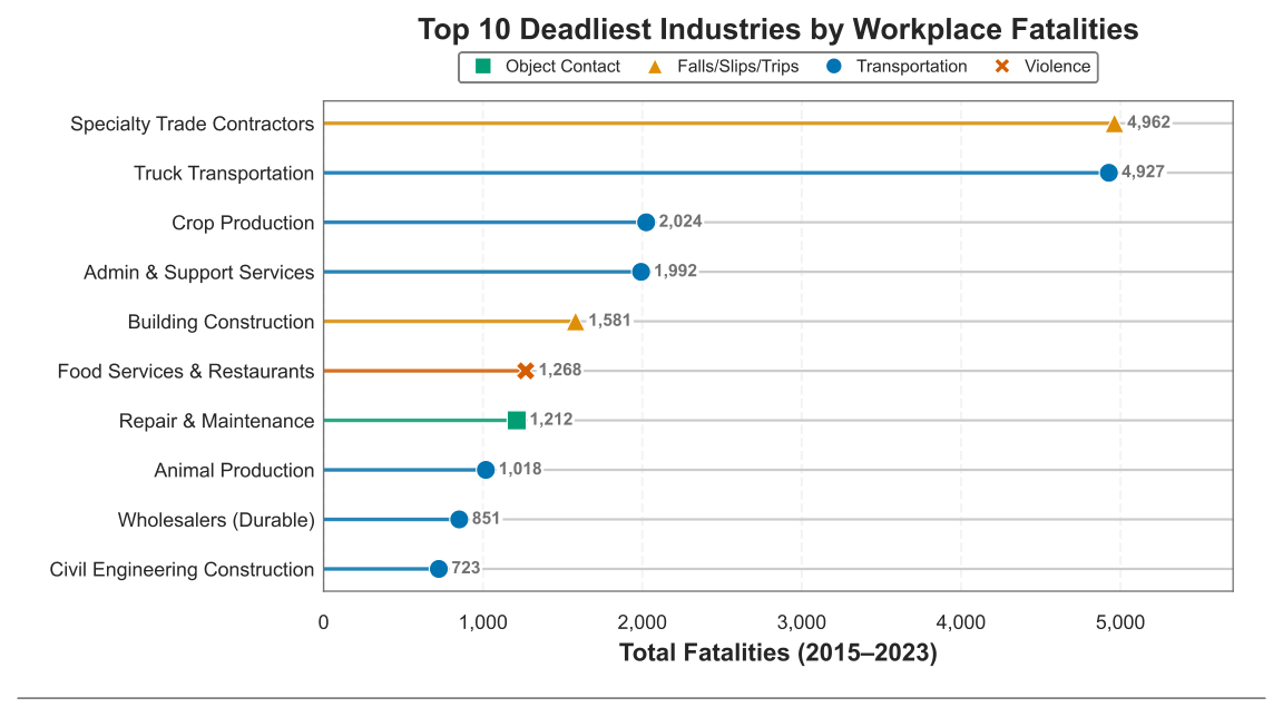
# Visualization 4: Top 10 Deadliest Industries (Lollipop Chart)
# ============================================================
import warnings
warnings.filterwarnings('ignore')
import pandas as pd
import matplotlib.pyplot as plt
import matplotlib.ticker as mticker
import seaborn as sns
# Wong colorblind-safe palette (Nature Methods 2011)
WONG = sns.color_palette('colorblind')
ANN_GRAY = '0.45'
FALLBACK_GRAY = '#999999'
# Map each cause to a Wong palette color
CAUSE_COLORS = {
'Transportation incidents': WONG[0], # Blue
'Falls slips trips': WONG[1], # Orange
'Contact with objects or equipment': WONG[2],# Green
'Violent Acts by Persons or Animals': WONG[3],# Red
'Exposure to Harmful Substances or Environments': WONG[4],# Purple
'Explosions and Fires': WONG[5], # Brown
}
# --- Accessibility: distinct shapes for B&W printing ---
CAUSE_MARKERS = {
'Transportation incidents': 'o', # Circle
'Falls slips trips': '^', # Triangle
'Contact with objects or equipment': 's', # Square
'Violent Acts by Persons or Animals': 'X', # X-mark
'Exposure to Harmful Substances or Environments': 'D', # Diamond
'Explosions and Fires': 'P', # Plus
}
CAUSE_SHORT = {
'Transportation incidents': 'Transportation',
'Falls slips trips': 'Falls/Slips/Trips',
'Contact with objects or equipment': 'Object Contact',
'Violent Acts by Persons or Animals': 'Violence',
'Exposure to Harmful Substances or Environments': 'Harmful Exposure',
'Explosions and Fires': 'Explosions/Fires',
}
NAME_MAP = {
'Specialty Trade Contractors': 'Specialty Trade Contractors',
'Truck Transportation': 'Truck Transportation',
'Crop Production': 'Crop Production',
'Administrative And Support Services': 'Admin & Support Services',
'Construction Of Buildings': 'Building Construction',
'Food Services And Drinking Places': 'Food Services & Restaurants',
'Repair And Maintenance': 'Repair & Maintenance',
'Animal Production And Aquaculture': 'Animal Production',
'Merchant Wholesalers, Durable Goods': 'Wholesalers (Durable)',
'Heavy And Civil Engineering Construction': 'Civil Engineering Construction',
}
# Load and deduplicate BLS data includes overlapping NAICS levels
# truncate to 3-digit and dedup to avoid double-counting fatalities.
df = pd.read_csv('data/Dangerous Jobs.csv')
df = df.dropna(subset=['NAICS'])
# Can't just filter to 3-digit rows some fatalities only exist at
# 4,5,6 digit level. Truncate all codes to 3 digits instead.
df['NAICS_3'] = (
df['NAICS'] // 10 ** (df['NAICS'].apply(
lambda x: len(str(int(x)))) - 3)
).astype(int)
df = df.drop_duplicates(subset=['NAICS_3', 'Cause', 'Year'])
# Total fatalities per industry - top 10
totals = (
df[df['Cause'] == 'Total.Fatalities']
.groupby('NAICS_3')['Fatalities']
.sum()
.sort_values(ascending=False)
.head(10)
)
# Map NAICS_3 -> MajorGroup name
naics_names = (
df[['NAICS_3', 'MajorGroup']]
.drop_duplicates(subset=['NAICS_3'])
.set_index('NAICS_3')['MajorGroup']
)
# Dominant cause per industry
causes = df[df['Cause'] != 'Total.Fatalities']
by_cause = causes.groupby(
['NAICS_3', 'Cause'])['Fatalities'].sum().reset_index()
dominant = by_cause.loc[
by_cause.groupby('NAICS_3')['Fatalities'].idxmax()]
dominant_map = dominant.set_index('NAICS_3')['Cause']
# Build plot data (reversed so #1 at top)
plot_naics = totals.index.tolist()[::-1]
plot_vals = [totals[n] for n in plot_naics]
plot_labels = [NAME_MAP.get(naics_names[n], naics_names[n])
for n in plot_naics]
plot_colors = [CAUSE_COLORS.get(dominant_map[n], FALLBACK_GRAY)
for n in plot_naics]
plot_markers = [CAUSE_MARKERS.get(dominant_map[n], 'o')
for n in plot_naics]
# Chart
fig, ax = plt.subplots(figsize=(7, 4))
fig.patch.set_facecolor('white')
ax.set_facecolor('white')
y_pos = range(len(plot_naics))
# Stems
ax.hlines(y=y_pos, xmin=0, xmax=plot_vals,
color=plot_colors, linewidth=1.5, alpha=0.8)
# Unique marker per cause for B&W accessibility
for xi, yi, ci, mi in zip(plot_vals, y_pos, plot_colors, plot_markers):
ax.scatter(xi, yi, color=ci, marker=mi, s=60,
zorder=3, edgecolors='white', linewidth=0.5)
# Value labels
for i, (val, color) in enumerate(zip(plot_vals, plot_colors)):
ax.text(val + 80, i, f'{val:,.0f}', va='center',
fontsize=7, color=ANN_GRAY, fontweight='bold',
bbox=dict(facecolor='white', edgecolor='none', pad=0.8))
# Y-axis white bbox so grid lines don't cross through labels
ax.set_yticks(list(y_pos))
ax.set_yticklabels(plot_labels, fontsize=8)
for lbl in ax.get_yticklabels():
lbl.set_bbox(dict(facecolor='white', edgecolor='none', pad=1.5))
# X-axis
ax.xaxis.set_major_formatter(
mticker.FuncFormatter(lambda x, _: f'{int(x):,}'))
ax.set_xlabel('Total Fatalities (2015\u20132023)',
fontsize=10, fontweight='bold')
ax.set_xlim(0, max(plot_vals) * 1.15)
ax.tick_params(axis='x', labelsize=8)
# Title
ax.set_title(
'Top 10 Deadliest Industries by Workplace Fatalities',
fontsize=12, fontweight='bold', pad=25)
# Grid only between the data area, not behind labels
ax.grid(axis='x', alpha=0.2, linestyle='--')
ax.set_axisbelow(True)
# Border around the plot area
for spine in ax.spines.values():
spine.set_visible(True)
spine.set_edgecolor(ANN_GRAY)
spine.set_linewidth(0.6)
ax.tick_params(axis='y', length=0)
# Legend
used_causes = sorted(set(dominant_map[n] for n in plot_naics))
handles = [
plt.Line2D([0], [0], marker=CAUSE_MARKERS[c], color='w',
markerfacecolor=CAUSE_COLORS[c], markersize=7,
label=CAUSE_SHORT.get(c, c))
for c in used_causes
]
ax.legend(handles=handles, loc='lower center',
bbox_to_anchor=(0.5, 1.02),
ncol=len(used_causes), fontsize=7,
framealpha=0.9, edgecolor=ANN_GRAY,
handletextpad=0.3, columnspacing=1.0)
plt.tight_layout()
fig.add_artist(plt.Line2D([0, 1], [0, 0], transform=fig.transFigure,
color='0.5', linewidth=0.8))
plt.show()Code
# ============================================================
# Visualization 5: Sex Disparity Table (Matplotlib Table)
# ============================================================
import warnings
warnings.filterwarnings('ignore')
import numpy as np
import pandas as pd
import matplotlib.pyplot as plt
# Colors
HEADER_BG = '#08519C'
DISEASE_BG = '#C6DBEF'
ROW_STRIPE = '#DEEBF7'
BORDER_CLR = '#08306B'
GRID_CLR = '#CCCCCC'
# Load data — statewide, by sex
df = pd.read_csv('data/CADiseases.csv')
df_ca = df[(df['County'] == 'California') & (df['Sex'] != 'Total')].copy()
# Overall stats per disease
overall = df_ca.groupby(['Disease', 'Sex'])['Cases'].sum().reset_index()
overall_wide = overall.pivot_table(
index='Disease', columns='Sex', values='Cases', fill_value=0
).reset_index()
overall_wide['Total'] = overall_wide['Male'] + overall_wide['Female']
overall_wide['Male_Pct'] = (
overall_wide['Male'] / overall_wide['Total'] * 100)
overall_wide['Female_Pct'] = (
overall_wide['Female'] / overall_wide['Total'] * 100)
overall_wide['MF_Ratio'] = (overall_wide['Male'] /
overall_wide['Female'].replace(0, np.nan))
# Top 10 by total cases
top10 = overall_wide.nlargest(10, 'Total').copy()
disease_list = top10['Disease'].tolist()
# Period breakdown for trend calculation
df_ca['Period'] = pd.cut(
df_ca['Year'],
bins=[2000, 2008, 2015, 2023],
labels=['2001-2008', '2009-2015', '2016-2023'],
)
cases = df_ca[df_ca['Disease'].isin(disease_list)].groupby(
['Disease', 'Period', 'Sex'])['Cases'].sum().reset_index()
cases_wide = cases.pivot_table(
index=['Disease', 'Period'], columns='Sex',
values='Cases', fill_value=0).reset_index()
cases_wide['Total'] = cases_wide['Male'] + cases_wide['Female']
cases_wide['Male_Pct'] = (
cases_wide['Male'] / cases_wide['Total'] * 100)
# Get first and last period male % for trend
period_pcts = cases_wide.pivot_table(
index='Disease', columns='Period', values='Male_Pct')
# Merge into final table
table_data = top10[['Disease', 'Total', 'Male_Pct',
'Female_Pct', 'MF_Ratio']].copy()
table_data = table_data.merge(
period_pcts[['2001-2008', '2016-2023']],
left_on='Disease', right_index=True)
table_data['Trend'] = (
table_data['2016-2023'] - table_data['2001-2008'])
table_data = table_data.sort_values(
'Total', ascending=False).reset_index(drop=True)
# Shorten long disease names for table readability
table_data['Disease'] = table_data['Disease'].replace({
'Shiga toxin-producing E. coli (STEC) without HUS':
'E. coli / STEC (without HUS)',
'Shiga toxin-producing E. coli (STEC) with HUS':
'E. coli / STEC (with HUS)',
})
# Build cell data
col_labels = ['Disease', 'Total\nCases', 'Male\n%',
'Female\n%', 'M:F\nRatio', 'Trend']
cell_data = []
for _, row in table_data.iterrows():
tv = row['Trend']
sign = '+' if tv > 0 else ''
cell_data.append([
row['Disease'],
f"{row['Total']:,.0f}",
f"{row['Male_Pct']:.1f}%",
f"{row['Female_Pct']:.1f}%",
f"{row['MF_Ratio']:.2f}",
f"{sign}{tv:.1f}",
])
fig, ax = plt.subplots(figsize=(7, 3.8))
ax.axis('off')
ax.set_title(
'Sex Disparity in California\u2019s Top 10\n'
'Communicable Diseases, 2001\u20132023',
fontsize=10, fontweight='bold', pad=12,
color=HEADER_BG)
table = ax.table(
cellText=cell_data, colLabels=col_labels,
cellLoc='center', loc='center',
colWidths=[0.32, 0.14, 0.12, 0.12, 0.12, 0.18])
table.auto_set_font_size(False)
table.set_fontsize(8)
table.scale(1, 1.4)
n_rows = len(cell_data)
n_cols = len(col_labels)
# Style header row
for j in range(n_cols):
cell = table[0, j]
cell.set_facecolor(HEADER_BG)
cell.set_text_props(color='white', fontweight='bold', fontsize=8)
cell.set_edgecolor(BORDER_CLR)
# Style data rows
for i in range(1, n_rows + 1):
for j in range(n_cols):
cell = table[i, j]
cell.set_edgecolor(GRID_CLR)
if j == 0:
cell.set_facecolor(DISEASE_BG)
cell.set_text_props(fontweight='bold', ha='left')
elif i % 2 == 0:
cell.set_facecolor(ROW_STRIPE)
else:
cell.set_facecolor('white')
plt.tight_layout(rect=[0, 0, 1, 0.92])
fig.add_artist(plt.Line2D([0, 1], [0, 0], transform=fig.transFigure,
color='0.5', linewidth=0.8))
plt.show()